Tired of duplicating effort to update two near-identical web properties, Butler Machinery decided to merge its Butler Ag website into a redesigned corporate site. Through an involved discovery and client education process, the team settled on a minimalist, photo-centric design. Project involved coordinating across departments and getting client buy-in to create a full slate of mockups and module options. Project management, UX and development by the team at Snapshot.
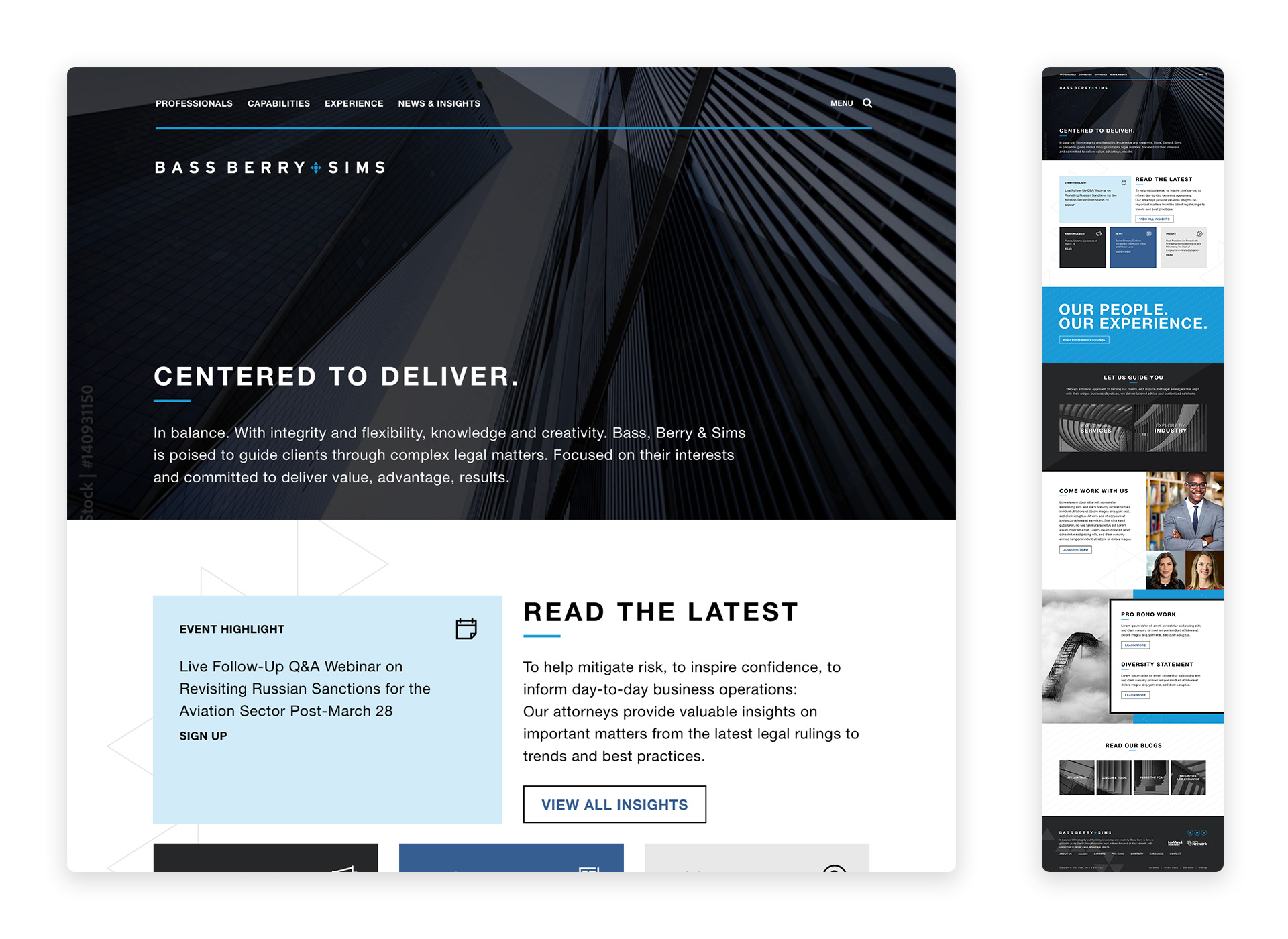
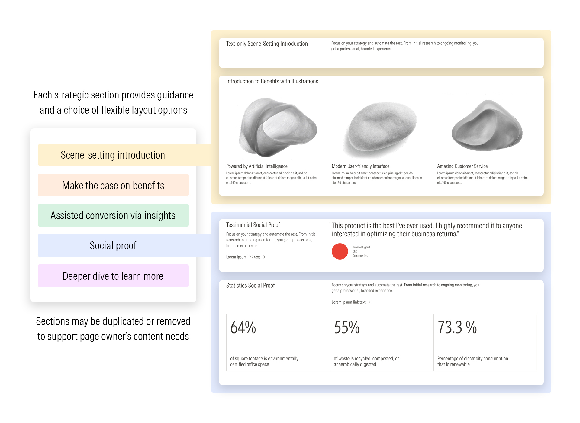
After long satisfaction with Snapshot Interactive’s work, law firm Bass, Berry & Sims chose to refresh the website for their centennial. Staffing changes in the early stages made for a significant evolution in the design’s layout and look. The project quickly recovered client buy-in after resetting with new web design-based art direction. Ultimately this led to an extensive set of mockups and lineup of module variations, allowing the client control over their own pages post-development. Development and direction by the team at Snapshot.
As one of the world’s foremost experts in defining safety standards, Underwriters Laboratories is part of our daily lives. They were looking to build a microsite for visitors to navigate through all corners of a city and discover that breadth for themselves. The resulting site was built from the ground up on customized Bootstrap and Nunjucks code. UX and illustration by UL’s in-house marketing team.
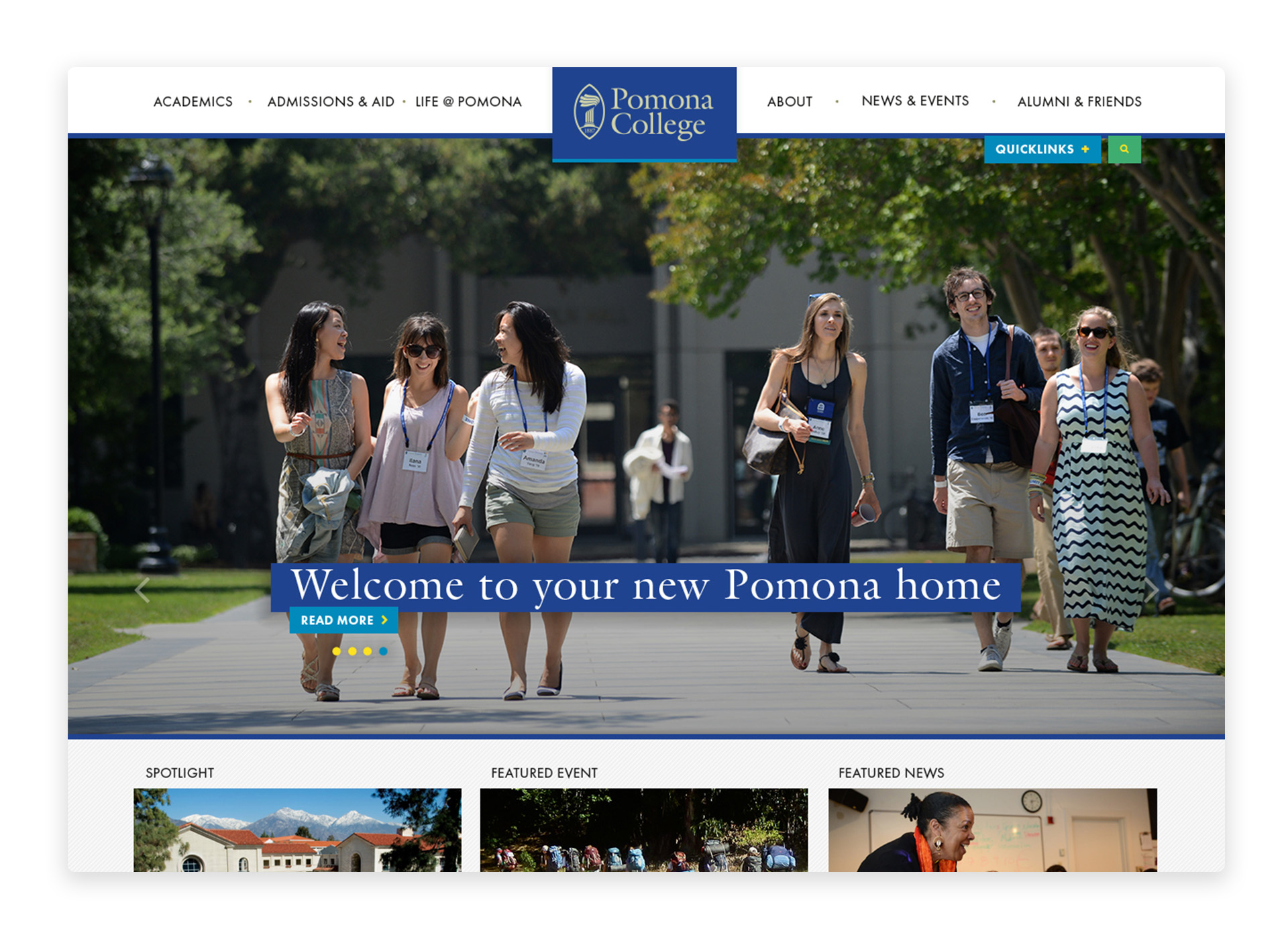
Prestigious “West Coast Ivy” Pomona College wanted a new website that reflected their open-minded California learning environment while being conscious of their top-notch rankings. Project included designs for 20+ responsive pages as well as thorough style documentation for implementation. The sunny evolution of Pomona’s color palette was such a hit that it carried through to the next site design, some seven years later. Functioned as primary designer on the team at NewCity, which provided project management, art direction, and extensive user research. Development by KWALL.
2U had great design bones in its 150+ year history, but they had become scattered over the years since Seymour Fleishman drew the iconic anvil logo. A unifying refresh was needed for the progressive faith community. The challenge was to honor the many voices and needs of the congregation: from vibrant activist events to solemn contemplative rituals, from young and scrappy to mature and historic. Key was also to build a toolkit robust enough to withstand many hands, creating a living, evolving voice without becoming a static or precious design. Work received the annual "Back Bench Award" for contributing behind the scenes.
Heavy equipment data management startup Fast Iron had made a strong start in serving sales teams at Caterpillar dealerships around the U.S., and their tools were ready to serve sales teams in the global market. To get there, they would need a new logo that spoke to their impressive data handling within the heavy industry.
Concept and design a corporate holiday campaign for printed card, filmed video, and animations for both social media and multilingual emails. The solution needed to be secular, globally applicable, on brand, and underscore the company mission to make the world a safer place. It also needed to be relevant to both employees and customers. The team developed four initial concepts for corporate leadership review, focusing on the breadth of UL’s involvement in holiday safety and optimism about the future. Project management, art direction, copywriting, and animation by UL’s in-house marketing team.
Design a logo for Cooking Fools experiential cooking events business. The previous logo had a local-touch catering aesthetic, and the business had developed in a different direction since that time. Goal was to convey a balance between the intense professional kitchen feeling of reality cooking shows (Cooking Fools’ most popular teambuilding event) and the cool, corporate, minimalist style preferred by the client. The final solution relied on the play of Celsius degrees and Fahrenheit degrees, as on a professional stove. Project direction by Orange Propeller.
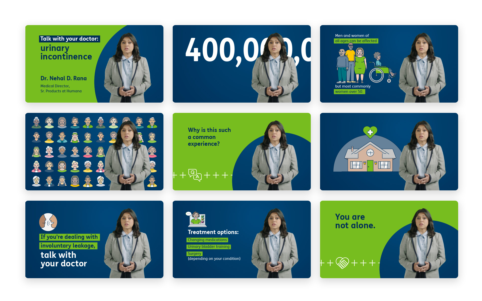
The Go365 wellness program needed to level up the look of their informational videos for both Medicare and general healthcare audiences. Following clear brand guidelines and using a limited library of assets, the storyboards needed to provide a fresh visual for new videos addressing common health topics. Filming, animation, production and project management by the team at Snapshot.
With health and hygine a rising concern, UL wanted to highlight their Everclean service for consulting with the food safety industry. Partnership, rather than policing, was the most important take-away, while ensuring the stock footage itself showed proper safety practices. Script and video production by UL’s in-house marketing team.